You spend hours polishing every bullet point on your resume, then export it as a Word doc with three different fonts, misaligned dates, and margins that shift every time you edit a single line. Most applicants never realize that messy formatting is the first thing recruiters notice—and the first reason they skip reading the content altogether. This is exactly the problem Jobly resume style tools are built to solve: taking your raw experience and locking it into a layout that actually looks professional without you needing to fiddle with indentation for an hour.
What Goes Wrong with Manual Resume Formatting
When you build a resume from scratch in Word or Google Docs, small decisions pile up fast. You pick a font that looks clean on your screen but turns jagged on a recruiter's laptop. You add a column for skills, then realize dates in your work history don't align. You insert a table to organize sections, and suddenly the whole document breaks when you convert it to PDF. These aren't minor annoyances—they're structural problems that make your application harder to read and easier to discard.
Another common trap is over-designing. You find a template with icons, progress bars, and a photo slot. It looks slick on Pinterest, but when a hiring manager opens it in a standard email client or an ATS parser strips the formatting, half your content vanishes or gets scrambled. Style matters, but only when it serves readability rather than decoration.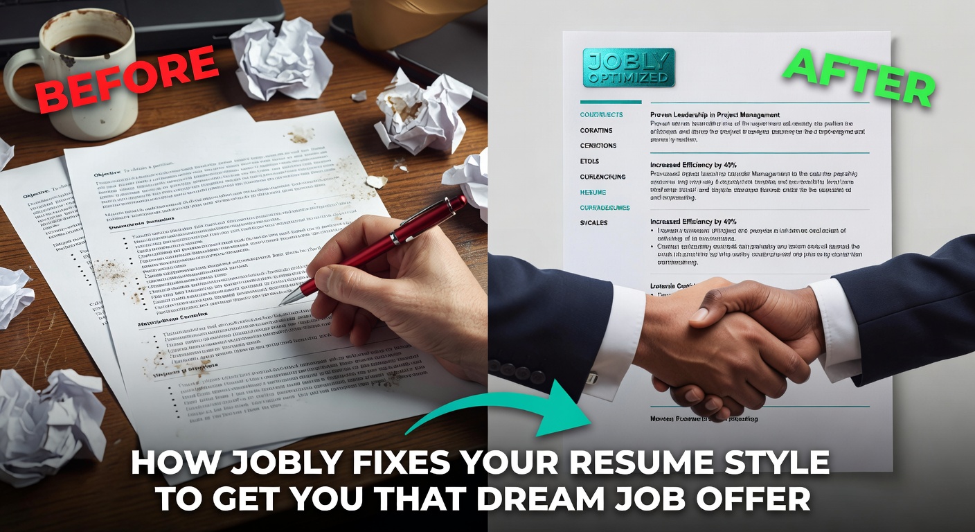 How Jobly Handles Layout and Visual Consistency
Jobly takes the formatting decisions out of your hands in a way that actually helps. You enter your experience, skills, and education into structured fields, and the engine maps that content onto pre-built layouts designed for standard hiring workflows. Fonts, spacing, section ordering, and margin widths are preset and locked. You don't choose between Calibri and Garamond—you just pick a template variant and let the system enforce consistency across every heading, bullet, and date stamp.
This matters more than it sounds. A recruiter scanning sixty resumes in an afternoon relies on visual rhythm to find information quickly. When every section on your document follows the same weight, indent, and alignment rule, they can locate your most recent role or your technical skills in under two seconds. Jobly's templates prioritize that scanning rhythm over creative expression, which is the right tradeoff for most job applications.
Concrete Scenarios Where This Makes a Difference
Scenario one: You're a recent graduate with limited work history. Your content is thin, so you're tempted to spread it across a two-column layout with a big skills graphic. Jobly pushes you toward a single-column format that keeps the reading order linear and avoids the visual bloat that makes a sparse resume look even emptier.
Scenario two: You're switching industries and need to emphasize transferable competencies over chronological job titles. Jobly lets you reorder sections—putting a "Key Projects" or "Relevant Skills" block above your work timeline—without manually hacking the document structure. The formatting stays intact even when you rearrange content priorities.
Scenario three: You're applying to a company that uses an ATS system. You've been using a Canva template with embedded graphics and custom text boxes. The ATS reads it as gibberish. Jobly's output is plain-structure HTML and PDF behind a clean visual layer, so the parser extracts your data correctly while the human reviewer still sees a polished document.
Scenario four: You need a cover letter that visually pairs with your resume. Matching headers, consistent fonts, aligned margins—doing this manually is tedious and often inconsistent. Jobly generates both documents from the same style engine, so they look like they belong together without any extra effort on your part.
Tradeoffs and Alternatives Worth Considering
Jobly's approach works well when you want speed and consistency, but it has real limits. The template selection is curated rather than vast. If you need a highly unconventional layout—say, an infographic-style CV for a creative agency pitch—Jobly probably won't give you enough design freedom. You're working within a controlled system that prioritizes ATS compatibility and recruiter readability over visual uniqueness. That's a smart default for most corporate and tech applications, but it won't cover every edge case.
If you want more layout control, tools like Canva or Figma give you pixel-level flexibility. The cost is time: you'll spend longer adjusting spacing, testing PDF exports, and fixing alignment bugs. If you want deeper content help—say, rewriting bullet points for impact—Jobly's AI assists with phrasing, but a dedicated writing coach or a service like Teal offers more granular sentence-level coaching. The tradeoff is always between convenience and customization. Jobly sits firmly on the convenience side, and that's the right call for most people who just need a clean, readable application out the door tonight.
One more practical concern: Jobly generates cover letters alongside resumes, which saves effort, but the letter content leans generic if you don't customize the prompts. The formatting matches perfectly, but you still need to inject specific details about the role and company to make the letter feel like it was written for that job, not just formatted for it.
Bottom Line
Resume style problems are rarely about aesthetics alone. They're about whether your document survives the ATS parse, whether a tired recruiter can scan it in seconds, and whether your formatting holds together when you swap one bullet point for another. Jobly resume style handling solves these mechanical issues by locking layout decisions into tested, recruiter-friendly defaults. You lose some creative range, but you gain a document that actually functions the way a resume is supposed to: readable, parseable, and consistent from the first save to the final send. If your current resume looks different every time you open it, that fix alone is worth the switch.
Comments
Leave a Comment